Blog

Tsukemono chocolate reviewed by "My year in chocolate"

In five years of collaborating with local chocolatier, Samanta Bakker at Monsieur Truffe, we've never been reviewed, so I was very pleased when this review by LA-based chocolate blogger @myic2016 (Trish) popped up recently.

The Tsukemono bar enwrapped in a striking Katagami design is the most complete package we've ever produced thanks in large part to the skills of designer Ruby Mackinnon and collector Jo Doherty

The review.....

"Though I don’t get the chance these days to utilize my degree in International Business, I’m always on the lookout to try new flavours & discover tidbits about different cultures. This collaboration bar fulfilled both things 🙌🏻
.
Brunswick East’s (Melbourne, Australia) Design Store @theboroughs3057 collaborated with neighbour @monsieurtruffe to create a special chocolate bar for the launch of @paper_geishas’ katagami exhibition: chocolate made by @samanta_bakker & packaging design by @rubymackinnon.
.
What is katagami? I had no idea until this afternoon! It is the Japanese craft of making finely cut paper stencils that are bonded together with persimmon tannin and utilize carved openwork designs to create minute repeating patterns when dyeing cotton or silk for kimonos or other garments. This ancient art is considered an “Important Intangible Cultural Property” of Japan & I wish I lived closer to see the exhibit in person!
.
Another new-to-me term is tsukemono, which literally translates to “pickled things,” in this case BEETROOT 😲Photos don’t do justice to the vibrant purple pink, almost fuchsia, colour that appeared once I segmented tasting morsels from the pristine matte finish bar with a sharp snap, releasing a lightly floral & herbal aroma at the breakpoint.
.


Creamy base 70% Peruvian chocolate punctuated by a textured mouthfeel from the generous chunks of embedded freeze dried pickled beets and the occasional tiny seeds from the freeze-dried raspberries that provide the dominant fruity flavour notes.
.
Very grateful to Samanta & Caleb for all their efforts in fulfilling my order from the other side of the world 😲It took 3 weeks to get here to SoCal, but worth the wait!! 🥰"

Thanks Trish.

Q&A with Steve Wide and Michelle Macintosh

Onsen of Japan.

Michelle and Steve are a thoroughly generous and inspiring couple. I've been fortunate to get to know them over the last three years. Together they have written several books on Japan, individually they have created books on famous people in music and art and on crafting.

Their work transcends the obvious boundaries I would have assumed for a guide or how-to book, instead, their books are full of warmth and passion highlighting their deep connection to their subject. 

In the days before we launched Onsen I asked them some questions about this book and working together.

Alasdair: How did your fascination with Japan and Japanese culture begin?

Michelle: In year eleven at hight school I had a Japanese exchange student in my class, she taught me origami and many interesting things about Japan. At university I became obsessed with Japanese (mostly logo) design. I also studied cinema history at university and the films or Ozu, Kurosawa and the film Tampopo made huge impressions on me.


A: One thing I’ve noticed talking to people who have travelled to Japan is that they rarely visit once, why do you think this is?

M: If Japanese culture is something that fascinates you or appeals to you, one visit will start a life long love of travel to the land of the rising sun. 


A: How many times have you travelled to Japan?

M: Aound 40. We have been going 3-4 times a year for the past 10 years and 1-2 times a year since the late 90s. We have spent winter in Japan ever year for the past 20 years.


A: Is each visit research for a new book project?

M: We started writing books on Japan 5 years ago, 15 years after our first visit. Every trip now does involve the making of a book (or 3) however I would always call each trip a holiday as to us this work a passion to us.

A: Have you developed a network of friends in Japan and has this influenced your projects?

M: We have close friends in Japan, people we love a d love to visit. Japanese design has always influenced my work, no more now than when I was at university. It’s a life long love.


A: Your latest book, Onsen of Japan, is very detailed. It covers the history of bathing in Japan to water type and etiquette - how long did it take to amass this information.

M: It took two years to write Onsen of Japan. We travelled all over the country and experienced so many different kinds of onsen and sento. We learnt so much about each town bath their bath houses. We also learnt a lot about ourselves in the making of this book. How to relax, how to take time out to experience different things, get outside our comfort zones, how to travel to remote areas and how to talk to people about what public bathing means to them.

A: How do you prepare for a writing task like this, where do you start and what reading did you do? Are there any books, you'd like to share with us that you found most fascinating on the subject of Onsen culture?

M: There isn’t really a book on onsen culture, I think ours is the first of its kind. Our book is the culmination of conversations, experiences, staying in ryokans. My brother is a Professor of Glaciology and my sister inlaw has a doctorate in earthquakes so I am very interested in the earth science of hot springs.


A: It seems that Onsen are a place of national health and well being, both physical and mental, how do you think they contribute to everyday wellness in Japan?

M: Families visit together, people of all ages enjoy hot springs. It doesn’t cost much money to visit and it can set you up for the day or help you wind down at the end of the day.


A: The concept of wellness is relatively new in mainstream Australian society, do you feel that there's a well-established understanding of wellness in Japan?

M: It’s part of people’s ever day in Japan, not an expensive marketing catch phrase or  expensive spa visit. Many sento visits in Japan are under $5, some rural onsens are free you can get a multiple onsen passes in onsen towns for around $15 


A: Is Onsen culture part of an holistic approach to life?

M: People visit onsen for health reasons, to relax or as a social visit with friends of family. ‘Supersento’ are visited on weekend by the whole family, you can stay for lunch, have a beer, a massage or even spot of nude yoga! 


A: Do you have a favourite Onsen or Onsen region

M: Kinosaki Onsen and Kusatsu Onsen are brilliant Onsen towns if you are looking for a day experience where you can try a few different kinds of baths.


A: What is your favourite pastime in Japan when you're not researching?

M: Visiting galleries, vintage shopping, doing craft classes, eating seasonal food, everything really!


A: Collaboration is at the heart of your published work, do you have strict roles you observe when you’re working together

M: Steve does most of the writing and I do most of the photography and design the book. We plan the listings based on our visits and joint opinion, and always do a read through together. If there are any listing skewed subjects I am passionate about I will write them or give Steve lots of notes.

A: Thank you for taking the time to talk, I know you're busy preparing for another deadline! See you at the launch.

Copies of Onsen of Japan, collaborative chocolate, bathhouse packs and Hinoki pine soaps available in-store. 

Q & A with Flavia Dent

East Brunswick is a special neighbourhood.

We're very fortunate to be situated a couple of doors away from East Elevation cafe and chocolatier, Monsieur Truffe, it was here we met Flavia
Like many creatives, travel informs her practice. Melbourne has been her home for the last two years. Before Flavia heads back to the UK we discussed her work and plans.

Broadwater Farm Estate, Tottenham

Alasdair: Your output is multidisciplinary, tell me where you commenced investigating the world through visual media?

Flavia: It’s how I understand things. Expressing myself visually is how I can put ideas together best as well as put them across to others. I have a background in drawing and painting, mainly portraiture. Once I was given a film camera at the age of eighteen I started photographing the streets of London and then my works orientated themselves towards Brutalist architecture. My lens soon focused on social housing estates built in the 1960s and 70s, my photographs devoid of human presence despite my earlier interest in portraiture.


A: Words or images, which do you find the most powerful and evocative?


F: I find images to be so, or at least I find them to have a bigger effect on my senses. I struggle with words but have, over time, been drawn to writing abstract poems. I began putting the two together in mid-2015 when I started my project Concrete Farm, of which you’ll find pictures from in this exhibition. It was a way for me to record the on-site visits I did to different social housing estates in and across London. These took a poetic form and were published in a newspaper to accompany the exhibition that first showcased back in June 2015.


A: How important is travel to your work?

F: Despite having travelled a little, although not necessarily for photography purposes, I always get drawn back to London and it’s brutal post-war architecture. Although I am set in my ways when it comes to my love for concrete, travel has helped me become more open-minded, something which is enriching both personally and for my practice. As I am headed back to the UK in August, Poland will be in the vicinity and is on my To Do list.


A: If you could live and work anywhere, where would that be and why?

F: I would live in Melbourne and photograph in London. Melbourne’s home, despite only being so for the last two years and London has the housing programs, some of which are integral to British heritage. I wish to submerge myself in the campaign to restore rather than regenerate post-war buildings once back in London by further developing my project Concrete Farm and working with charities such as The Twentieth Century Society and not-for-profit organisations such as DOCOMOMO International. Both are major players not only in the realm of conservation but also in the broader field of architectural culture.


A: Works for The Boroughs show is very much about a particular place, tell us what that place means to you?

F: Broadwater Farm Estate, BWF, in North London features in some of the shots included in Concrete Holm. I moved to the estate four years ago. I actually moved into the old school there. It was no longer being used for its built purpose. It looked onto the estate, notorious for two major London riots. Our building was gated and only one-storey high. We were at the car park level, high concrete legs supporting the tower blocks spread in front of me, bays and corridors just outside my window. I started to photograph these and worked on a series with a close friend. It was home and it nurtured my obsession with concrete, car parks, and housing estates.


A: The images that you are showing with us at The Boroughs reflect an interest in a particular form of architecture and its effect on the people that live within it, can you tell us about this?

F: The works feature three public housing estates based in and around London. One unique in British history in being the crucible for two major riots, a generation apart, which I happened to call home for two years. Another is a Graded II building and another again features in the film A Clockwork Orange as well as others. These estates were originally built to solve London’s housing shortage in the 1960s and 70s. At this time, London was struggling to cope with the post-war housing crisis and many people lived in terrible conditions. These new cities in the sky were hailed as model cities and people felt optimistic about them. Over time a lack of investment and infrastructure has meant dilapidation and now regeneration processes, not necessarily in favour of current residents. They exemplify forgotten futures. I’m interested in the effect an environment has on people. I’m interested in the politics, Grenfell Tower and the big property developers such as Berkeley Homes and their contribution to England’s housing history.

Thamesmead

A: Which building is your favourite?

F: The Westgate car park in Oxford is a rather perplexing choice I must admit. People find it hard to believe anybody liked it for reasons other than parking your car before it was knocked down in 2015, and even then, that was expensive and unpleasant for most but for me. I don’t have a car. Its stacked concrete horizons slant slightly to the left, fortified tower–like corners on each end home stairs to get you either to your car or to the shopping centre. It was bleak and beautiful.


Flavia's exhibition "Concrete Holm" opens at The Boroughs on May 31st at 6.30 pm.

Q&A with The Gents

We love signs at The Boroughs, so we’ve invited The Gents to exhibit images from their recently released book, Signs of Australia. 

The Gents, for those who are unfamiliar with their work, are the talented team of Brady Michaels and Dale Campisi. Together they write books, contribute to newspapers and magazines, art direct, photograph, activate spaces and manage events.

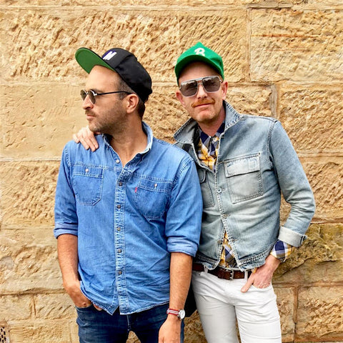
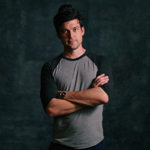
Dale Campisi and Brady Michaels

The Gents spend part of their lives in the idyllic surrounds of Tasmania, in their recently completed home at Hunting Ground, and the rest in Melbourne. Here they lead tours of the city and its significant buildings and contribute to the city’s culture, through retail ventures and space activation.

Like The Boroughs crew, The Gents share a love for place and community. In all their work there’s a strong reference to the unique attributes of a particular place, the community that supports it and the culture therein.


We all met in 2010 when The Gents were involved in Melbournalia, a very successful Pop-Up, space activation project featuring Melbourne made and designed products. At that stage, The Gents were working as publisher/editors with an independent, boutique-publishing house, Arcade.


Alasdair: Tell us about Arcade and how you came to be involved in publishing.

 Dale: We’ve always been interested in telling stories, and Melbourne’s rich history is a great source of inspiration. Brady was working as an artist and graphic designer, and Dale as a writer and editor, and we realised we had the combined skills to make a book.

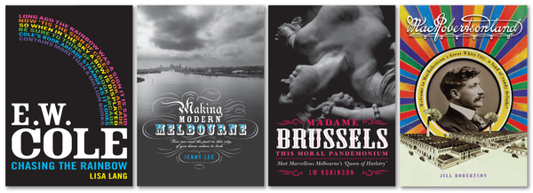
Arcade books ~ Chasing the Rainbow by Lisa Lang, Making Modern Melbourne by Jenny Lee, Madame Brussels by LM Robinson and MacRobertsonland by Jill Roberston


We formed Arcade with another couple, Rose Michael and Peter Daniel, in 2007. We published thirteen pocket books about Melbourne's past, which started with EW Cole – the eccentric visionary bookseller and publisher of the nineteenth- and early twentieth century. (He’s most famous for his Cole's Book Arcade, which was on Bourke Street opposite where Myer is now, and for publishing Australia’s biggest selling kid’s book, Cole’s Funny Picture Book, which was in print for over 100 years and sold more than a million copies in that time.)

We discovered Cole’s amazing story through our pal, Lisa Lang. She wrote our first “little book” – Chasing the Rainbow – and then went on to write the award-winning Utopian Man, a fictional representation of his life. And shortly after Arcade called it a day, we created a new version of the classic Cole’s Funny Picture Book with Hardie Grant Books, renamed Cole’s Funny Little Picture Book. So we have a lot to thank EW Cole for! He was a great inspiration to us and still is.


Coles Funny Little Picture Book


A: How did you move from publishing to retailing?

D: When we started Arcade, the publishing industry was experiencing a real rough patch due to competition from other forms of entertainment, bookstores were closing en masse – particularly the majors – and there was a lot of fear about e-books killing the print book. We took that as a challenge, presenting our stories as “events”: in addition to publishing each book, we hosted walking tours, fashion parades, salons and even pop-up bars as a way to connect with new audiences and create community around our business of sharing history.

The success of our events highlighted that we there’s more than one way to tell a story – and sometimes the margin is higher too!


A: At Melbournalia, The Gents were responsible for the visual identity, consumer engagement/marketing and the event program. How did it all come about?


Melbournalia identity MKI designed by Brady Michaels

D: Melbournalia was a great business to conceive and establish. The four originating partners each had important skills to contribute to its success. Certainly, there was a gap in the market for a local goods and souvenir store: Melbournians love Melbourne, and the city has a long history of making and manufacturing. The creation of local icons was also already in its ascendancy in the early 2010s, so we had a good starting point.

But when we entered retail it too was experiencing a rough patch, and we didn’t have any angel investors or deep capital investment. We knew we needed to do something different to capture people’s attention and then lace it with a healthy dose of FOMO. So we launched with four simultaneous pop-ups (in a warehouse, a cafe, an office building and a busy coffee joint).


A: Did you respond to each of locations in a different way and did this influence your marketing?

 D: Each store had a slightly different offering which encouraged customers to visit all of them, which many did. It became like a mini self-guided walking tour of the CBD and both tourists and locals loved that. That approach kept our overheads low and allowed us to test different markets across the city. It was also crazy fun swapping stories when we met up at the Home store at the end of each day. That sense of fun translated into our customer service.

Melbournalia Home ~ Franklin Street Melbourne 2011


A: What drew the public to Melbournalia, and who was your audience?

Brady: The events program was all about reaching different types of people and injecting fun into retail. Crucially, everything we sold had a story that could be told in different ways. One week we’d host a book launch or makers talk, the next we’d set fire to a Christmas pudding and learn about what Melbournians ate in the nineteenth century. We did pom-pom workshops and sessions on growing native plants. We always remained open to new ideas.


Dale looking the part at Melbournalia @ The Queen Victoria Market in 2012 

 
The audience was always locals and visitors alike: people who are interested in place, people who love local, people looking for the real story of a place. Our customers loved that we knew the makers and that they could meet them too, that our products were designed and made locally, and that their dollars supported small business.


The visual identity of Melbournalia was key to introducing ourselves to our potential customers from the outset, and the design evolved from the original pop-ups (which had a postal theme, as we had an in-store postal service!) to a more refined and timeless identity which (we think) still looks great today. The aim was to make our identity sleek and design-y (to reflect the design-led nature of most of our products), but friendly and accessible enough to appeal to a wide audience. Pops of bright colour always help!


Melbournalia identity MK II designed by Brady Michaels


A: What made it so special?

 B: We think the concept was really strong and there was a lot of love shared between us, our customers and our suppliers. The ‘local love’ vibe was palpable.


It was about this time that The Gents started spending part of their time in Melbourne and Hobart.

 A: What projects did you work on in Tasmania?


Railway Roundabout Fountain ~ Hobart


D: Brady grew up in Hobart, so we’ve been visiting Tasmania regularly since we met in 2002. Our first project was writing a guidebook (the first that we know of) to the city for Hardie Grant Books. We also worked on Tasmanian arts and culture magazine Island for a time (myself as Editor of four issues and Brady as Art Director of 12 issues), and also wrote about 30,000 words for the updated  discovertasmania.com.au website.  I also developed and produced Open House Hobart: an architecture festival which grew to an audience of over 15,000 in 2017.


A: You’re both very involved in the visual/creative and social culture of Tasmania, tells us about the projects you’re currently working on?

 D: In 2018 we are very focused on our property Hunting Ground. We filmed the restoration for a TV show which will air on the ABC in August. Hunting Ground has a chapel, which we’re launching as a solar-powered event space. Our first event is a native high tea and presentation with author and wild/native foods expert Reese Campbell. We’re also lucky to have an ex-MONA chef just across the road! We’re also exploring new photography books projects with our publishers and hope to undertake more epic road trips to get to the heart of this fascinating country in which we live.


The Gents' property Hunting Ground in Tasmania's southern midlands 


A: How did Signs come about?

B: We were approached by our publisher New South Books to develop a book concept around ghosts signs: vintage faded signs that are often found on old buildings. There was a proven interest in the topic in America and an emerging interest in ghost signs here in Australia, particularly Melbourne. It was a topic that interested us too, as we are particularly focused on history and the built environment.


A: When did you start photographing signs?

 B: I had been photographing old signs for years before the Signs book project came about, especially in Melbourne as part of my Grouse Melbourne photography series. It was one aspect of the built environment that I thought revealed so much about the city. The advertising, the outdated products and services and the different styles of typography were all fascinating to both of us, like layers of a city that could be explored to reveal more behind the surface. So the prospect of travelling all over Australia in search of signs was simply too good to pass up!

Broken Hill ~ New South Wales

A: Tell us about the process, you travelled 40,000 kms to create this book!

B: Yes, we sure covered a lot of ground! Most of it was done on the road, which is kind of essential to really get a sense of how huge and diverse Australia is. We did it in four major roads trips (Dale still had a job in Hobart, so a gap year wasn’t an option), each of which took 2-3 weeks. With the time limitations, each trip had to be really well-planned (I spent a lot of time on Google maps!), with just enough flexibility to take side trips of the main route when curiosity called. We literally raced from town to town with only a small window of time to stop and shoot in each place, no matter the weather or light conditions. It was basically drive-stop-shoot ... repeat! Dale would drop me off at one end of town, driving to the other end (often via the local bakery!) while I walked the length of the town, shooting as I went. We’d also walk or drive down side streets, back streets and laneways in search of hidden gems. The big cities required much more time and effort - I would stay for at least a week, using public transport to get around and often walking over 30km a day to explore the areas I thought would be rich in vintage signs: inner suburbs, outer suburbs, industrial areas etc. It was hard work but great exercise! I photographed thousands of signs along the way, 500 of which made it into the book, which I also designed. New South kindly gave me complete creative control over the selection and design process. So, with photo editing, design and layout to be done, the Signs journey continued in my studio in Hobart long after the travel ended. Going through all of my photos brought back so many wonderful memories of our adventures!


A: Signs is a selection, would you like to publish Volume 2?

 B: Sure, there’s probably enough content for a 10 volume box set! Of course, from a publishing perspective, it’s all dependent on how well the first book does, so fingers crossed it resonates with a broad audience.


Which are your favourite images in the book and why?

 B: I love them all for different reasons: the memories of a particular place, the beautiful typography and design of a sign, the light and weather conditions that I was lucky to experience at a certain time. But there are images that I feel are particularly strong, maybe because they are a combination of all of the above. My absolute favourites would have to be ‘Broken Hill Ice & Produce’ sign (for its mid-century elegance, clear blue sky and light/shadows), the Shelley’s Famous Soft Drinks (for its beautifully faded signage and the classic Australian milk bar it is attached to), the Skipping Girl, Dandy Pig and Pink Poodle neons (all heritage listed and rightly so), the Dingo Flour sign in Fremantle (it’s a WA icon and several storeys high to boot!), and the Kevin Corby Chemist sign in Hobart, mostly because it’s the first sign that made it into my visual memory bank. As a bright-eyed little kid from the Huon Valley, seeing this sign on Macquarie Street - the main road into town from the Huon - was always an exciting moment. It may as well have flashed in its bright neon letters ‘welcome to the big smoke, boy!’.


Surfers Paradise ~ Gold Coast ~ Queensland


Kevin Corby ~ Hobart ~ Tasmania


Signs of Australia opens at The Boroughs, March 22nd at 6.30 pm.

Kayleigh Heydon - Strength and Resilience

Creativity has been the buzz word around the regeneration of our neighbourhood over the last 20 years. Brunswick East continues to be a strong drawcard for creative people. 

A relatively recent newcomer to our block is Kayleigh Heydon, you've most likely seen her working as a picture-framer with the team at Frames Readymade.

Kayleigh brings a strong aesthetic she developed at The Manchester School of Art where she graduated in 2014.

Since arriving in Melbourne, she's travelled widely absorbing herself in Victoria's landscape, drawing from the diversity of nature in the bush and along the coastlines. in fact, she seems to have covered more of Australia than most of us born here manage!

Alasdair: Tell us a little about your background?

Kayleigh: After graduating from Manchester school of art in 2014 I moved to Melbourne. I worked casually so I could free up as much time as possible to push myself into the new landscape, getting lost in the bold and elegant flora and fauna. 

A: I would describe your work is clean, simple and elegantly balanced, how would you describe it?

K: My work has strong influences from the post-war era, around the time of the Bauhaus school and when first wave feminism was really coming into light. I think it was a really exciting time for artists as there was so much change and retaliation to traditional artistic practices and methods. I am endlessly inspired by Jean Arp, his sculptures, poems, paintings (just everything) and Noguchi’s playground designs.

A: Where do you turn for inspiration?

K: I’m drawn to the purity of form in architecture and industrial design, furniture and light, more so than other paintings and artworks. I also find that moving around and being outdoors is beneficial for me. Music inspires me, I'm always listening to something from somewhere and probably louder than acceptable. Recently it’s been Senegal 70, which is amazing, but an old favourite is the Giles Peterson London boiler room set, it just really puts me in a good mood. I’m not sure if you can sing along with a sax, but I do!

A: How has your work evolved since you've moved to Melbourne?

K: My style has evolved quite organically, there's a discourse between each body of work, you can really see how I ended up here, which I really like. I reintroduced mono printing and spontaneous line movement back into my practice recently and I think that’s probably the only sidestep, but I love doing them, it really breaks up the days. I do mono-printing to refocus myself if I get stuck or distracted.

A: What theme/themes are you dealing with in the work you're showing at The Boroughs?

K: It’s about women and anyone who identifies as a woman and the strength and resilience in us. It's celebration of our experiences and recognition of what is still to be achieved. The bold, harsh and strong lines, soft curves and silhouettes reveal the way we are not one, but a balance of all these things. I see all of the pieces as a question and answer sequence, the shapes moving around one another, taking on different attitudes and coming across challenges and harbouring experience. The shapes are all solely taken from lines and movement occurring in everyday life, from the shape of the bed head to the shadow cast on the table from my mug.


Kayleigh is showing at The Boroughs from Wednesday, November 1st to 14th.


OSTRO ~ Julia Busuttil Nishimura

With the launch of Julia's latest book, OSTRO nearly upon us we thought we'd have a chat about her approach to food, cooking and family life in the age of social media.


Alasdair MacKinnon:  Julia you are an incredible and inspiring home cook. As an advocate for organic food principals and eating in sync with the seasons I'm really looking forward to your book. Growing up I was fortunate to spend weekends with my aunt and uncle who lived on a small farm an hour or so from Melbourne.

They grew almost everything that later made it's way to the dinner table (animal and vegetable). 

They were vehemently opposed to pesticides and chemical fertilisers, instead, composting and enriching the soil naturally. This wasn't something they thought of as special, it was partly a thrifty way to provide for their children and a way of living passed down from their forebears. I guess this informed my own eating habits and lifestyle.

Now as a proud home cook with a foundation in organically grown ingredients enriched by my time spent in the kitchens of Stephanie Alexander and Melbourne's longest running vegetarian restaurant, Shakahari

I'd love to know more about your influences and how you developed into such a prolific cook. 

Julia Ostro: I’ve always loved being in the kitchen. To me it’s a familiar and comforting space. So many of my childhood memories are of cooking with my mum, aunties and cousins. Without forgetting that food importantly a meal on the table, it has always also been a link to our culture and family history. In order to continue eating our traditional foods, our family would make a lot of things from scratch or source them from friends as you simply couldn’t buy things like rabbit or Maltese cheeses from the supermarket.

 It wasn’t until I lived in Italy that I felt those values so strongly again and made me reflect on my early years in the kitchen. Making food from scratch and sourcing local and seasonal produce from people you trust was the norm and a celebration. It now defines the way I cook.

 From quite a young age, I also found myself totally engrossed in cookbooks, keeping notes on flavour combinations or interesting pairings that I had never come across. I think the combination of my upbringing and this obsession with reading about food has lead me to become a reactive cook. I rarely head to the market or shops with a list, but rather let the produce or people influence my cooking.

AM: Tell me about your food philosophy and approach to home cooking and what lead you to publish? 


JO: In believe in starting with the best possible ingredients and keeping it simple. The best ingredients are, not so surprisingly, what’s in season. The taste and quality, not to mention, price are all reasons enough to eat with the seasons. The thrill when eating that first peach of the Summer, or when fresh broad beans begin to pop up in the markets are true moments of pleasure.

 For me, cooking is as enjoyable as eating – it’s relaxing and rewarding. I make a lot of food – pasta, cheeses, breads etc from scratch because it has some sort of process which allows me to be fully enveloped in the making. Being able to share this love of cooking was the driving force in wanting to write a book. I have always written my recipes down and shared them so having it documented formally is such a nice gift. I didn’t really feel rushed to publish though – I always wanted to write a book but also felt like it would happen when the time was right. I feel really fortunate that someone else saw it was my time and approached me.


AM: How important is the intimacy of Social media in developing a dialogue with your audience?


JO: It’s a rather strange concept – sharing your life day-to-day with thousands of strangers. Somehow though it is a really intimate community of people that genuinely support what you are doing. I think it’s so important to just do what you love and the rest will follow - being genuine on social media is how I’ve always strived to be. It’s easy to see trends and what other people are doing, but remembering that you have this community of people ‘following’ you, is lovely.

 Of course, there are lots of things that I don’t share too. I think it’s valuable to assess what you feel comfortable sharing and sticking to those gut feelings. You don’t have to be everything to everyone! My social media is made up of mainly food and family and they’re my two of my most fulfilling aspects within my life – I think people appreciate that authenticity.


AM: I can see from your social media that you travel extensively. My cooking is always expanded and developed through first-hand experiences gained travelling.


JO: I absolutely love to travel and feel like these experiences have completely shaped and inspired my cooking. It’s not even about mirroring exact dishes when I arrive home, but more about trying to capture some sort of feeling that was associated with a dish I might have eaten, or seeing a technique and being able to use it in my own cooking. Even the supermarkets in other countries can be a great source of inspiration.


AM: The Boroughs has some wonderful Japanese connections, can you share with us some of your favourite Japanese places to eat ? - did you know we were actually in Japan at the same time in May this year ?! 


JO: Recently in Kyoto, we had the most amazing meal at a small restaurant called Monk. The loveliest man, Yoshihiro, cooks a seriously incredible five or seven-course dinner, centered around the very large wood-fired oven in his rather tiny kitchen. Most things are sourced from his friend’s farm, just one hour away, and everything else has some kind of story. Set along the Philosopher’s Path – it’s calm, serene and really special.

Nori is such a wonderful cook so we don’t tend to eat Japanese food out here in Melbourne that often. I’m rather fond of Aka Siro in Collingwood though.


AM: Living busy Urban lives means many of us don't all have the option to grow food. In this neighbourhood of a East Brunswick we're fortunate to have CERES, they provide mostly locally grown organic veg, delivered to boot! We can shop locally and have access to food that matches our ethics. Tell me about your favourite local places to pick up ingredients, what's your kitchen staple ?! 


JO: I love shopping at the weekend farmer’s market – there are always interesting vegetable varieties, kinds that just aren’t available in regular supermarkets. These small growers are so important to our biodiversity so I really try and support them when I can. For us though, we find buying everything organic isn’t financially feasible so I like to emphasise the local and seasonal when discussing ingredients for recipes. I think that’s when growing our own veggies has become a really important aspect of our lives. As I am writing for a large range of people, it’s important to be aware that not everyone will have access to farmer’s markets or the means to purchase organic vegetables, for example, and is why I usually emphasise the benefits in choosing local and seasonal first.


AM: Urban living has also meant that our kitchens have become smaller, it's inspiring that all your cooking comes out of your little kitchen .. We talk a lot over the counter about apartment living here at The Boroughs. What kitchen essentials would you recommend for someone cooking from a small kitchen? Space saving tips are always welcome !! 


JO: I think people are always really shocked to see what my kitchen is like. For someone that cooks everyday, it’s very basic. The only electrical equipment I have is my stand mixer and an ice-cream machine, which doesn’t get used all that often. When you have the knowledge and skills to make things for yourself, with the least possible amount of equipment, you can make amazing food in tiny, based kitchens. A large mortar and pestle, some sturdy pots and a good quality kitchen knife are just a few of my essentials. We don’t have a toaster, or a microwave or an electrical kettle, which might seem absurd, but we grill our bread under the grill, reheat our food and boil our water on the stove. Our small space means maximising the already existing appliances and choosing equipment that has multiple-uses.


AM: Julia your beautiful family often features in your Instagram feed. It's lovely to see how good food and love go hand in hand. This I know to be true too as I met my love while shopping in an organic store, evidence that eating well leads to a good life. You share your love and goodness so beautifully and we really look forward to launching your recipes in the store, to sharing your love of food and welcome you and your family wholeheartedly. Thank you. 


JO: Thank you very much! I’m so looking forward to launching Ostro at the Boroughs.

Kester Black

Kester Black is exactly what we like to see when searching for a product to sell in our store; local, ethical and sustainable.

They provide their staff with a paid day off on their birthdays, offer ten additional paid days per year to staff wishing to volunteer, and match any registered charity donation made by their employees. Kester Black is currently on track to donate 15% of revenue to charity in 2017.

Kester Black manufactures all of their products in Australia, run their office completely on renewable energy, and are working towards becoming paper free.

The entire product including packaging is locally sourced, in order to reduce environmental impact, and all Kester Black nail polishes are 10-free, cruelty free, vegan and water-permeable.

Kester Black’s vision also aligns perfectly with our commitment to the Lygon Street Green Mile (http://morelandzerocarbon.org.au/lygon-st-green-mile/the-boroughs/).

So we're happy to support the brand and offer a wide range of their nail polishes, and soaps .

We also happen to think Kester Black make the nicest nail polish we’ve seen! 

We were keen to learn more about the inner workings of Kester Black, so we interviewed founder, Anna Ross.

The Boroughs: Did Kester Black spring from a love of nail polish or were there other influences?

Anna Ross: I actually began Kester Black as a jewellery label and a point came where I started researching enamel paint to use on the pieces I was making. This led me to nail polish, and what I saw was a significant gap in the market!

I had so many ideas and just went for it; everything seemed to grow naturally from that point. I decided to manufacture and sell my own nail polish line to complement my jewellery. It was a major turning point in my career when, as the jewellery market had become really saturated and my nail polish sales were going through the roof, I decided to focus solely on the nail polish side of things and lay the jewellery to rest.  

I decided to create an all-Australian brand that provided professional quality beauty products that did not compromise my social and environmental principles.

TB: Where does the name Kester Black come from?

AR: It was inspired by an idyllic faraway bay in New Zealand. I was out boating with friends and family one day in the Queen Charlotte Sound, New Zealand’s South Island, when I discovered beautiful St Kester Bay.

Across the bay was a solitary house, inaccessible by road and completely off the grid, which I later realised was owned by a priest, hence the choice of the colour black. That place was the pinnacle of New Zealand beauty to me and I wanted my business name to have a tie with where I came from.

TB: You refer to Kester Black as ‘inclusive.’ What makes Kester Black an inclusive brand?

AR: We focus on making our brand accessible to all individuals and avoid marketing our products to distinguished roles based on gender, race or religion. That’s why with all of our campaign imagery we exclude our model’s face from being able to identify with a wider audience.

Not many people know this but our nail polishes are made from a breathable base so that our Muslim community are able to use our products.

Our endeavours seem to be paying off, too. Our best (but really, our favourite) customer is a nine-year-old boy who visits us each year at The Big Design Market hosted in Melbourne just to come say hi!

TB: We love ethical business and it sounds like you take extremely good care of your employees. They must love you! Do you believe your employee friendly policies are good for business?

AR: Yes absolutely. I always wanted to build a company that people wanted to work for. Staff turnover is one of the biggest costs to small business so I have worked hard to create a positive workplace for my staff. I'm working hard to build a team that will hopefully stay with me for more than a year which seems rare these days!

TB: You made a political statement with the release of one of your new tones earlier this year, Impeachment, which included commissioning Ellen Porteous to make Trump-themed posters (https://www.ellenporteus.com/#/kester-black-impeachment/). At the Boroughs, we thoroughly enjoyed this statement and the beautiful soft peach nail polish that came with it. What was the reaction like elsewhere? Did you face any backlash?

AR: This was one of our favourite projects this year. We had so much fun working with Ellen and pasting up our posters around Melbourne. The reception was something else. We took our brand to another area where we haven’t normally and it’s paid off as the response has been overwhelmingly positive and supportive. There wasn't even one word of backlash!

It’s always been crucial to us to allow our customers to feel a strong connection to our brand and we wanted to bring light to an issue which meant a lot to our community.

TB: What local, ethical and sustainable brands do you like to support personally?

AR: I am really passionate about sustainability so one of my favourite local brands is Keep Cup. Everyone in the office has one and I often buy them for family and friends around Christmas. I think single use coffee cups are the worst! We also have Swell bottles so we don't have to buy any single use water bottles. My other favourite brand is Who Gives A Crap!. I buy all of my toilet paper from these guys. I always look for other ‘B Corps’ when I am buying any consumer goods, as I know they are all doing amazing things (Like us!).

Hester MacKinnon

Interview with artist - Ruby MacKinnon

Artist Profile – Ruby MacKinnon – ‘Thinking of Home’


Artist and graphic designer Ruby MacKinnon has a strong connection to the Boroughs. She is a past manager of the store, was responsible for the graphics of our rebrand in 2015 and her watercolour greeting cards are some of the store’s constant best sellers. It seems only right that she opens her first solo show with us this Friday Night.


Ruby’s debut solo show ‘Thinking of Home’ shares a series of watercolour artworks responding to the concept and experience of ‘home’. Ruby’s pieces contemplate the definition of ‘home’ in a time when the dream of owning one’s own home is becoming increasingly foreign to the younger generations of Australia. Ruby’s works draw on her own experience of moving from place to place but maintaining a sense of homeliness as well as gaining inspiration from the stories of others.


We spoke to Ruby ahead of her exciting debut show.


The Boroughs: What does ‘home’ mean to you? How did the concept become the inspiration for your show?


Ruby MacKinnon: One definition of the word 'home' is a place where something flourishes which really struck a chord with me when I was beginning to research this show. To me a 'house' is just a residential space, like an apartment or unit, but a ‘home' focuses on the people that inhabit the space and their distinct way of living within it. It’s how people create a feeling of home that fascinates me. A person’s home often tells you a lot about them – you can get a quick sense of the house holder just by seeing how they arrange their furniture or the art they display on their walls. 


I have always lived in rented dwellings so I am very accustomed to moving and have never associated my home with any particular building. As a kid I reveled in each new house, enjoying looking for its quirks and, hopefully, secret hiding places! But that has also meant that we never measured ourselves against any one door frame, and were never able to customise the house in any way besides the arrangement of our belongings inside or the plants in the garden. I look back fondly on all of my homes, however. All individual, all lived in for varying periods of time but all ‘home’.


TB: For one of the exhibition pieces, you’ve asked your friends and family to describe what ‘home’ means to them and created watercolour sketches of their responses. Did the responses you received surprise you?


RM: The responses to my questions 'What makes you think of home?' have been really interesting. Cats came up a lot! I love cats, so I get that, but I think it's also because, unlike dogs, cats live solely in and around one's home. A dog comes with you to the shops; a cat waits for you at your front door. 


The most interesting variation in response has been between those who determine home by how the space makes them feel versus those who recognise it for what it contains and what that signifies to them. 

For example some people imagine specific belongings when they think of home, others think of the feeling of safety and the opportunity to truly be themselves.


TB: How much do you find your work is naturally influenced by your ‘home’?


RM: A lot of the work in this show is very personal. It expresses my personal thoughts about home.


For one piece I painted the glassware (two vases and one small, coloured Saki bottle) that sits in my current apartment window. The vases have been in the window almost since we moved in and are very much linked in my mind to that space even though they came from my family's collection. I added the bottle to the display after a dinner out with some of my best friends. I associate the small collection with both my current home and situation, and homes of my childhood.


The card I am launching at the exhibition which features the message 'Home is where my mum is' includes a painting of a ceramic cup that is based off a cup I brought from my family home that was my own special chai cup when we were all together and has come with me to all my adult homes. 


TB: Is there a standout piece on display? Something you are most proud of?


RM: Of the large-scale pieces my favourite works are the vase of protea and the leaf.


The protea I painted as a gift for myself - the nice paper was gifted to me by my partner and I thoroughly enjoyed selecting the flowers and painting them at leisure. I'm particularly pleased with the reflections in the vase itself.


The leaf is painted from a real leaf I regularly walk past on the way to work. As I live in an apartment and can't have my own garden beyond pot plants in the window, I enjoy observing the sights, scents and seasons of my neighbours’ gardens. I have watched that particular leaf keenly as it ages and enjoyed all of its stages. The leaf is fully brown and crinkled now but still beautiful. I had admired it for some time when I saw it beginning to wither and discolour. I loved the soft fade from green at the top to the rusty orange at the bottom of the leaf and the graceful curl of the shrivelling end.


I'm also really looking forward to seeing all of the response pieces displayed together. I am hoping it will be a very positive and affirming collection. Everyone who responded associates home with warmth and positivity and we are all very lucky to do so.


TB: You use a lot of watercolour in your pieces. What do you love about the medium?


RM: I started to independently experiment with watercolour just after high school. I was given a little set and found it to be a very approachable and enjoyable medium. Like everyone who discovers watercolour I became very interested in the way the colour can bleed with different papers and techniques.


I love the softness of watercolour on paper and the unavoidable (at least in my case) touch of hand - the looseness of edges and the opportunity to playfully layer to give form and effect.


TB: What does it mean to you to have your debut show on display at The Boroughs?


RM: Having my debut show at The Boroughs is something unusual and special. The theme felt like the right fit for the location. There's a nice connection between a store where people buy goods to become part of their home, or the home of others, and artworks about the wares that I, myself, and my friends and family have collected to form our impressions of home.


There is also the family link - The Boroughs is my father's store and my sister and I have worked on and off there since he bought it several years ago. 


‘Thinking of Home’ opens Friday May 5, 6:30-8:00pm at The Boroughs Store with drinks and nibbles provided.


Hester MacKinnon

The Legend of Monga Khan, an Aussie folk hero

Monga Khan, although born in India, lived, worked and died in Australia. Monga was a hawker who sold goods in Victoria, helping the young Australian economy to grow.

Monga Khan’s photo has been kept for a hundred years in the Australian National Archive, along with his application for exemption to the White Australia Policy. It is only now, however, that he has been given a voice.


Enter Adelaide-born artist Peter Drew. His quest – to make Monga Khan famous, in order to re-write Australian folklore and redefine what ‘Aussie’ really means.

Peter began a crowd-funded campaign in an attempt to cover Australia with 1000 posters of Monga.

Peter Drew

The campaign received such strong support that Peter’s fundraising goal was exceeded and, as a result, he decided to use the additional funds to commission artists and writers to pitch in and create for Monga the historical fiction he deserved. These stories, poems, and artworks combine to form Peter’s book, ‘The Legend of Monga Khan, an Aussie Folk Hero’.


It is an honour to be launching this book at The Boroughs Store.


I remember when I first began to see Peter’s posters appearing around Australia. His ‘Real Australians Say Welcome’ campaign seemed to inspire the best in people and caught the eye of many other artists and creatives. Peter’s artwork is an inclusive breath of fresh air in a hostile political landscape of fear mongering and growing disdain for multiculturalism.


Peter’s message resonates with our community and customers and his posters on our walls never fail to start conversations.


It seems only appropriate to involve Peter himself in that conversation. I spoke to him ahead of the launch.


The Boroughs: Where did you find Monga Khan, and what drew you to him?


Peter Drew: I found Monga Khan's records in the Australian National Archive in Victoria. In 1916, he applied for an exemption to the White Australia Policy so he could travel back to India without fear of being kept out of Australia upon his return.


There are thousands of records like Monga Khan's in the Archive. I chose his simply because he looks heroic. It's the kind of image that makes you wonder 'who was that man? What was it like to be him?'


TB: What does it mean to you to be ‘Aussie’?


PD: The strength of openness.


TB: What do you believe is the benefit of Monga becoming a folk hero?


PD: Australia needs new myths – ones that reflect our multi-ethnic past and future – because without shared narratives we can’t form shared identities. It's important that some of those narratives are myths because only myths grant the reader tacit permission to make the imaginative leap necessary to really identify with the hero.

That's what myths are for! Constructing myths of this kind is fundamentally the job of artists.


TB: Who has collaborated with you on this project and how and why did you approach them?


PD: I approached Royce Kurmelovs to edit the book because I had a hunch he could pull it off in terms of skill, temperament, and sensitivity to the subject matter. Luckily I was right! In the beginning, I simply asked Royce to commission writers with knowledge of the migrant experience, so we naturally attracted a diverse group.


Nici Cumpston from the Art Gallery of South Australia wrote the foreword about her own family story, which spans the history of the cameleers and the Barkindji people of remote NSW. I thought it was the perfect way to ground the book in reality before embarking on our journey of myth-making.


The illustrations are by artists I admire, many of whom I've wanted to work with for a long time. That aspect of the project has been a real treat for me.


TB: Why did you decide to launch Monga’s story at the Boroughs?


PD: Because this project is all about community, and so is the Boroughs... Ever since you asked to display my posters I knew we had plenty in common.


Peter’s book of fictional short stories, poems and illustrations will launch in Victoria at The Boroughs on Wednesday, March 15, from 6:30 – 8:30.


‘ The Legend of Monga Khan, an Aussie Folk Hero’ features contributions from:

Royce Kurmelovs, Anne Waters, Nici Cumpston, Manal Younus, Kavi Guppta, Elizabeth Flux, Lindsay Nightingale, James Roy, Sukhjit Kaur Khalsa, Ena Grozdanic, Laurie May, Hop Dac, Kerri Ann Wright, Andrea Smith, Julian May, Dave Court, Tom Gerrard, Alasdair Mackinnon, Gabriel Cunnett, Freda Chiu, Kyoko Imazu, Rosie Turner, Joel Matheson, Gabriel Cole, Owen Foley, Paul Kisselev, Penny Ferguson, Yan Yan Candy Ng, Jake Holmes, Alice Lindstrom, Alexis Winter, Jake Bresanello, Minna Leunig, Amanda Ng, Emily Nelson and Lucas Grogan.


Hester MacKinnon

Tokyo Springtime at the The Boroughs

July brings real winter weather to East Brunswick, rainy days with grey skies and cold winds. It's that time of year when woollen gloves stay close at hand and a beanie is never far from my head.

Like an act of defiance to the season a delightful little piece of Tokyo springtime is drifting toward The Boroughs like a Sakura blossom caught on the breeze. 

UGUiSU is a Tokyo-based stationery, homewares, crafts and gift store founded in 2009 by Hikaru Komura. 

Hikaru, known to her friends as Hiki, will be transporting the best of her little store into our little store from Sunday July 17th to Sunday July 24th.

UGUiSU is similar to The Boroughs in that it was created to highlight the work of local artists, designers and craftspeople.  Hiki has successfully introduced the work of many Japanese artisans to her fans around the world, and now she is bringing a carefully hand-picked selection that includes items hard to find or obtain even in Tokyo to East Brunswick.

UGUiSU will present stationery, textiles, ceramic wares, jewellery, and traditional vegan candles all handcrafted or manufactured in Japan. Each piece has been chosen for its great design and high-quality manufacture. Also included beautiful riso printed wrapping paper made in collaboration with Melbourne artists Beci Orpin and Michelle Mackintosh.

The Boroughs is celebrating the event with a Japanese inspired collection of chocolate mini bars created by chocolatier Samanta Bakker from Monsieur Truffe and an Alice Oehr designed commemorative, limited edition tea towel, printed by Super Special Printing .