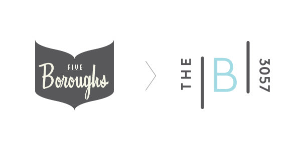
Hello again! A lot has happened since our last update and as you may have noticed our look has changed a little. The 3057 community is central to everything we do at the shop and now it's part of our new name and new look. Boroughs owner Alasdair MacKinnon approached local graphic designers 'The Contenders’ and the process of developing our new Boroughs identity begun! Among the team was Ruby MacKinnon: Designer, former Boroughs assistant manager and, as you may have guessed, Alasdair's daughter. Who better to help develop our new style! But why the change? Well, let's go straight to the source to find out...
ALASDAIR MACKINNON, OWNER OF THE BOROUGHS
You've recently changed the name of the shop, how come?
The name was changed for a number of reasons, most importantly our old name Five Boroughs refers to the 5 areas of the state of New York, Manhattan, Brooklyn, Queens, the Bronx, and Staten Island. Today The Boroughs is a reflection of the community that surrounds it, (a borough being a term for a town or district area) the designers, artists, makers, writers, photographers, and manufacturers. Over the last 30 years, Brunswick East has been transformed from a humble working class suburb where people lived close to the factories they worked in, to an area characterised by a mixture of creativity and sustainability. It's such an exciting place, where there are wonderful cafes, bars, restaurants, coffee roasters, chocolatiers, bakers, brewers, provenders, bike builders and venues all bearing the idiosyncratic imprint of their owners. Our new name is a reflection of our sense of place.
There is a snazzy new logo to match! How did you decide on the new Boroughs look?
Originally we approached The Contenders with the idea of incorporating The Boroughs store name into the existing logo. Once we had briefed them and they understood our connection to 3057, they built this sense of place into the final result. Initially Ruby showed us three directions, one was the new name in the old logo, the second took elements from the old logo to make a new one, and the third, is the one we chose which was a totally new direction. We're really excited about how it looks, what it means, and how the logo functions.
The shop is very much linked to the goings on of the 3057, did this inspire the new branding?
We're very connected to what's going on, from the stock we sell to the events we hold and our engagement with the larger community. Community was a huge influence on our branding. The inclusion of the postcode is the clearest indication of this connection.
RUBY MACKINNON, DESIGNER AND FRIEND OF THE BOROUGHS
Tell us a little bit about your work with The Contenders!
The Contenders is a Melbourne based creative agency. We help build new brands by creating the brand identity and story, strengthen existing brands with new visual or marketing strategies, and all the in between bits and pieces to make our clients' brands the strongest contenders in their respective markets. I got the opportunity to be lead designer on the rebrand of The Boroughs but actually I'm the littlest fish in this team, lucky enough to be working with some really accomplished and experienced designers and brand strategists.
What inspired your choice of colours for the new logo?
Previously, Five Boroughs had been designed with the primary colours of vintage blue/green and charcoal. We loved the old brand and wanted to carry some of it's features over to the new brand and colour seemed like a great way to do that.
We kept those colours as the primary colours for the logo but added in some new colours to the brand palette to give it a bit of playfulness and something new and fresh.
How did you decide on the new look for The Boroughs? What was it about the 3057 you wanted to capture?
When Alasdair came to The Contenders wanting a new logo to go with the new brand name 'The Boroughs' we felt like we could add something to really tell the story of the shop at 345 Lygon St. A sense of place.
A passionate love for the area of East Brunswick and it's people and produce is shared by the store and its customers and we wanted to make that the focus of the brand, showing The Boroughs within the community of '3057' in the brand mark.
Another really important and developing aspect of the Boroughs brand is its involvement with local makers in collaborative events and products. An important factor in designing this brand was working out how to incorporate collaborators in the brand's communications and product packaging.

We developed a visual system that highlights collaborators, front and centre to show how proud The Boroughs is to work with great local and international talent.
So there you have it, we're pretty excited about the new name and look for the shop so do pop in to check it out! And be sure to stay tuned to this blog for upcoming interviews and posts about the latest Boroughs news.
If you'd like information of the designers, people and events mentioned, follow the links below.
Ruby MacKinnon, The Contenders
Written by Claudia Long @ClaudiaLongsays — Video courtesy of Andrew McDowell

